Connect and Collaborate Today


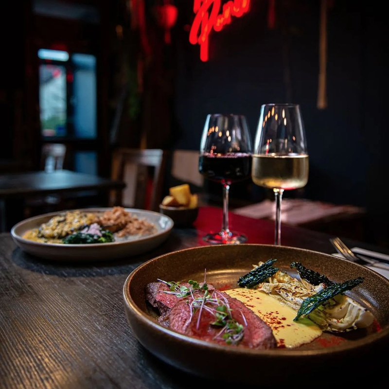
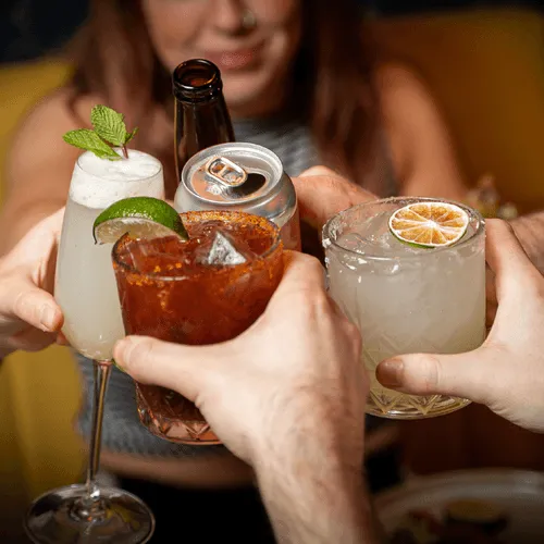
Cú is a Mexican fusion eatery that combines fresh local ingredients with bold traditional flavours. Its lively atmosphere and modern design attract young professionals and food lovers alike. The menu and cocktails celebrate a contemporary approach to Mexican cuisine.
Brand Identity
Brand Guidelines
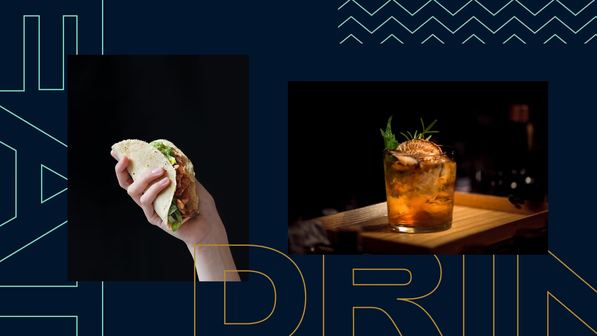
Web Design & Development
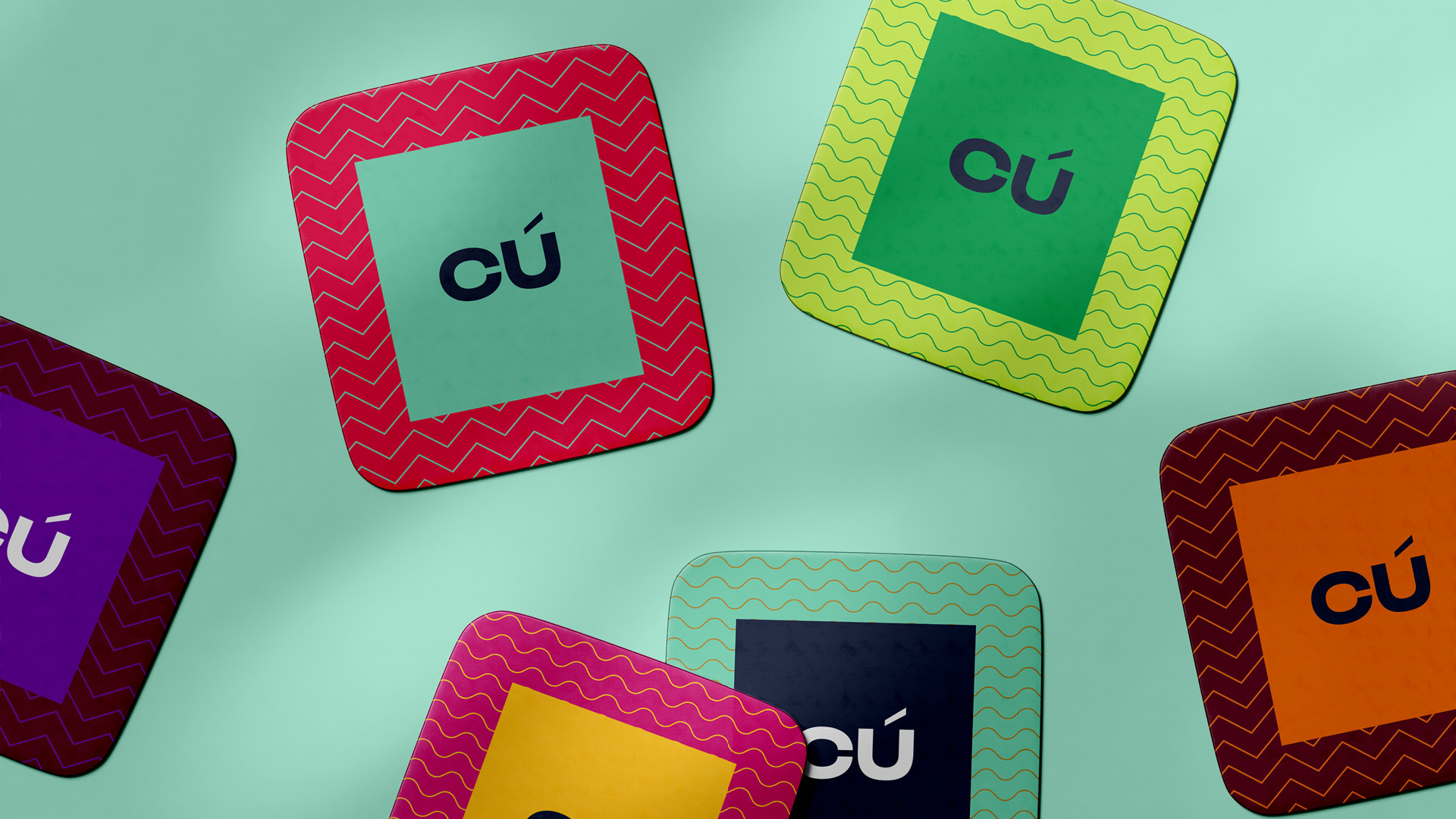
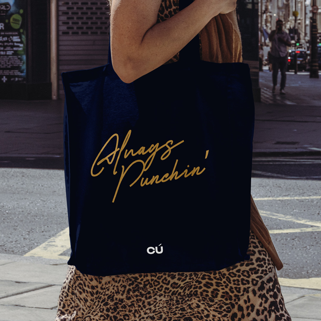
Packaging
Motion Graphics
Brand Launch
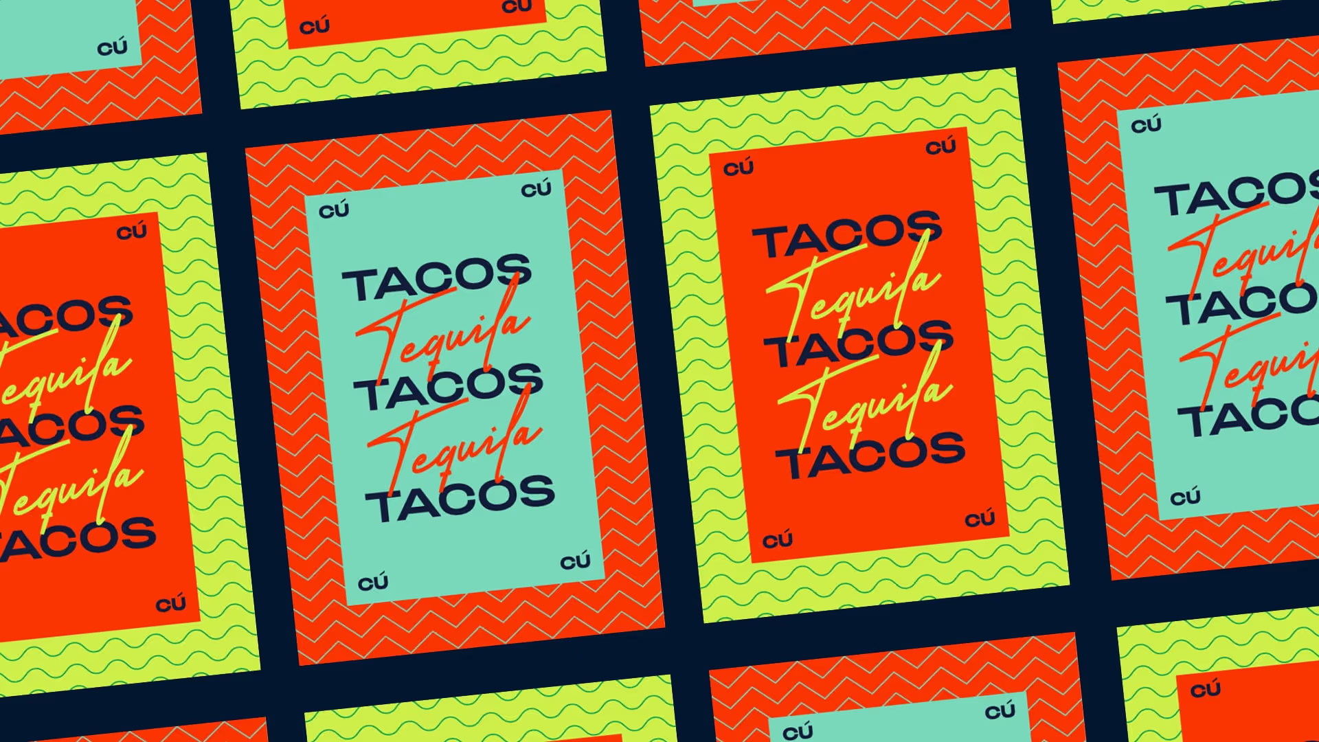
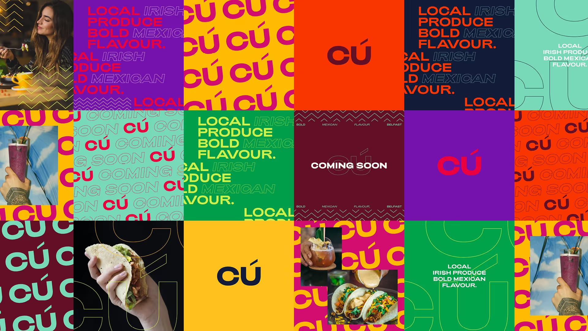
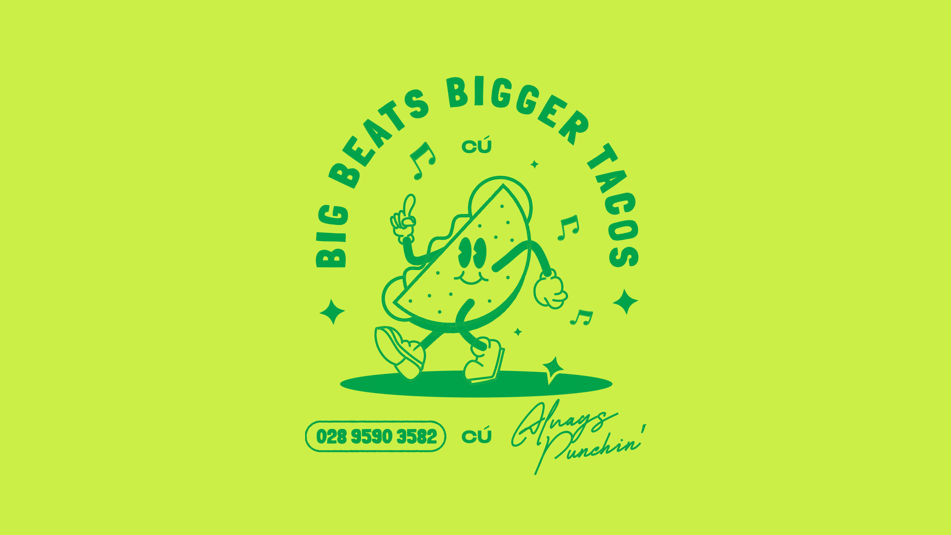
At Cú, bold Mexican flavors and locally sourced produce converge to craft a distinctive culinary journey that is lively, inviting, and brimming with energy. To encapsulate this ethos visually, I designed a bold and vibrant aesthetic inspired by typographic music dance sleeves.
The outcome is a pulsating and typographically bold brand identity mirroring the restaurant's lively and dynamic approach to food and beverages. Infused with undertones of Mexican flair, the identity exudes authenticity and cultural richness, reflecting the restaurant's fusion of traditional and contemporary elements.
Overall, the brand identity captures the essence of Cú's vibrant and refined ambiance, establishing a cohesive and compelling visual language that resonates with a diverse audience of food connoisseurs and young professionals alike.

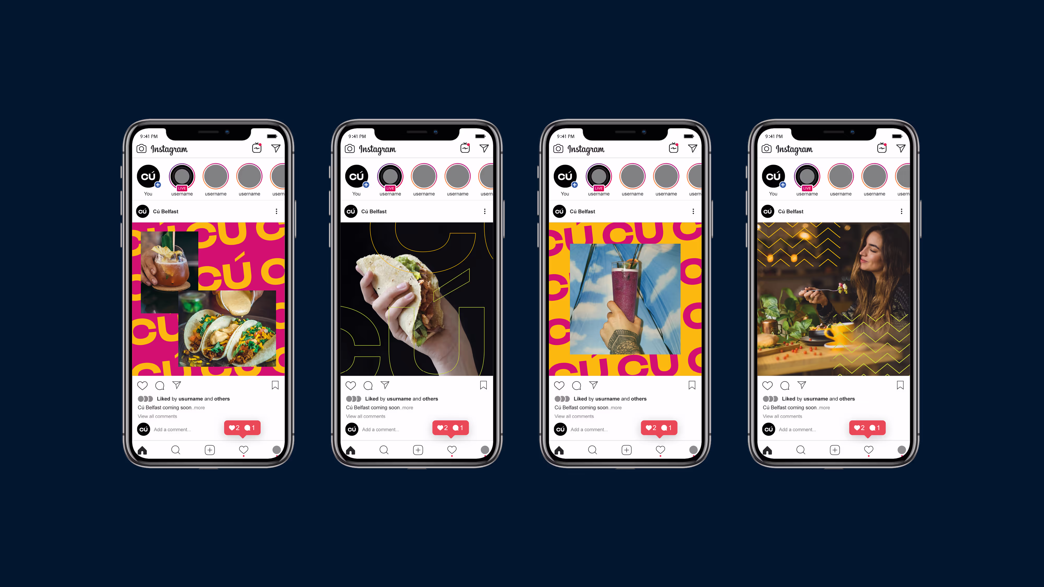
Cú blends bold Mexican flavours with local produce in a space full of energy. The identity is vibrant and type-led, full of movement and colour, capturing the restaurant’s dynamic approach to food and drink and speaking to a new generation of diners.

.avif)