Connect and Collaborate Today


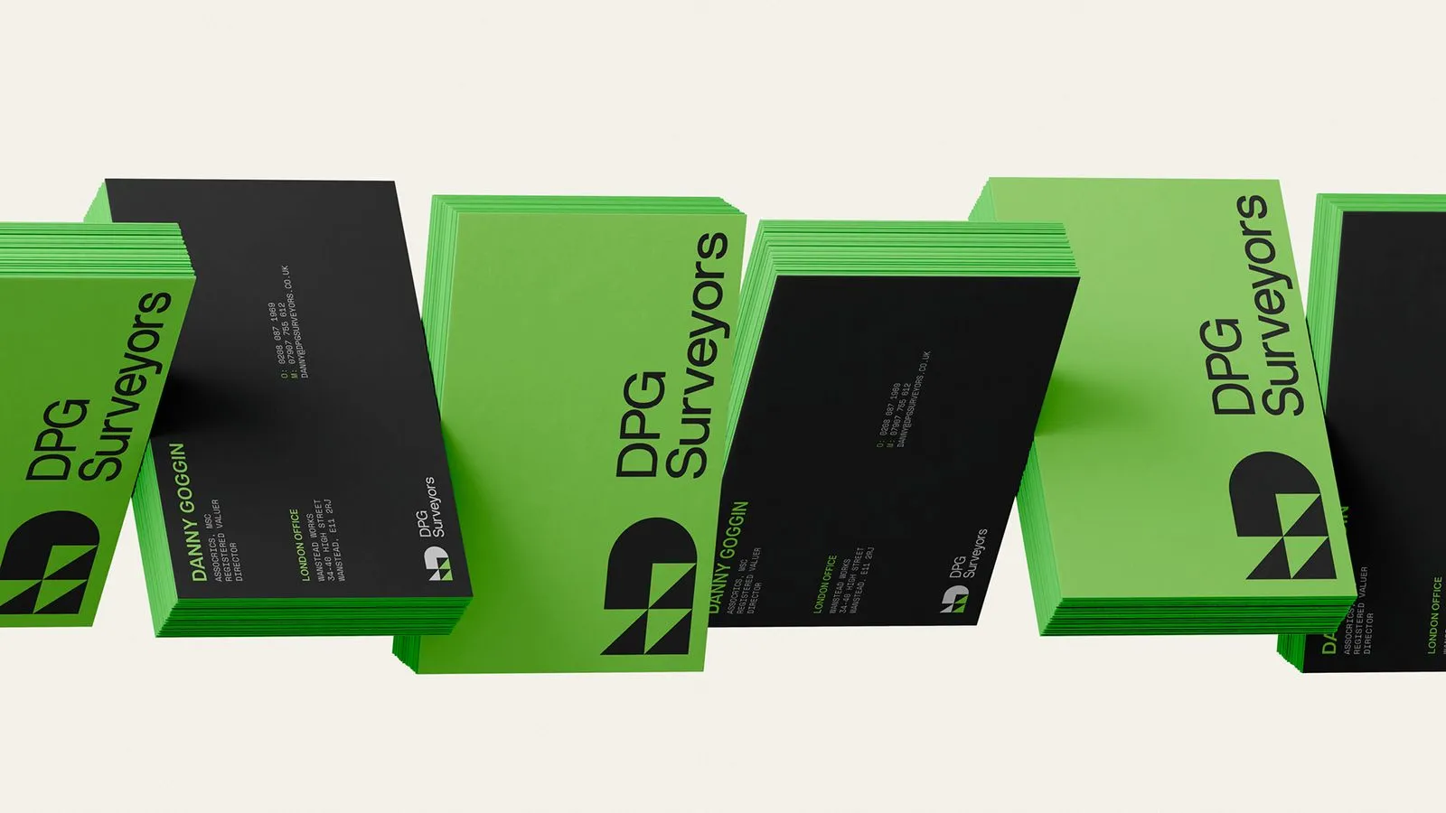
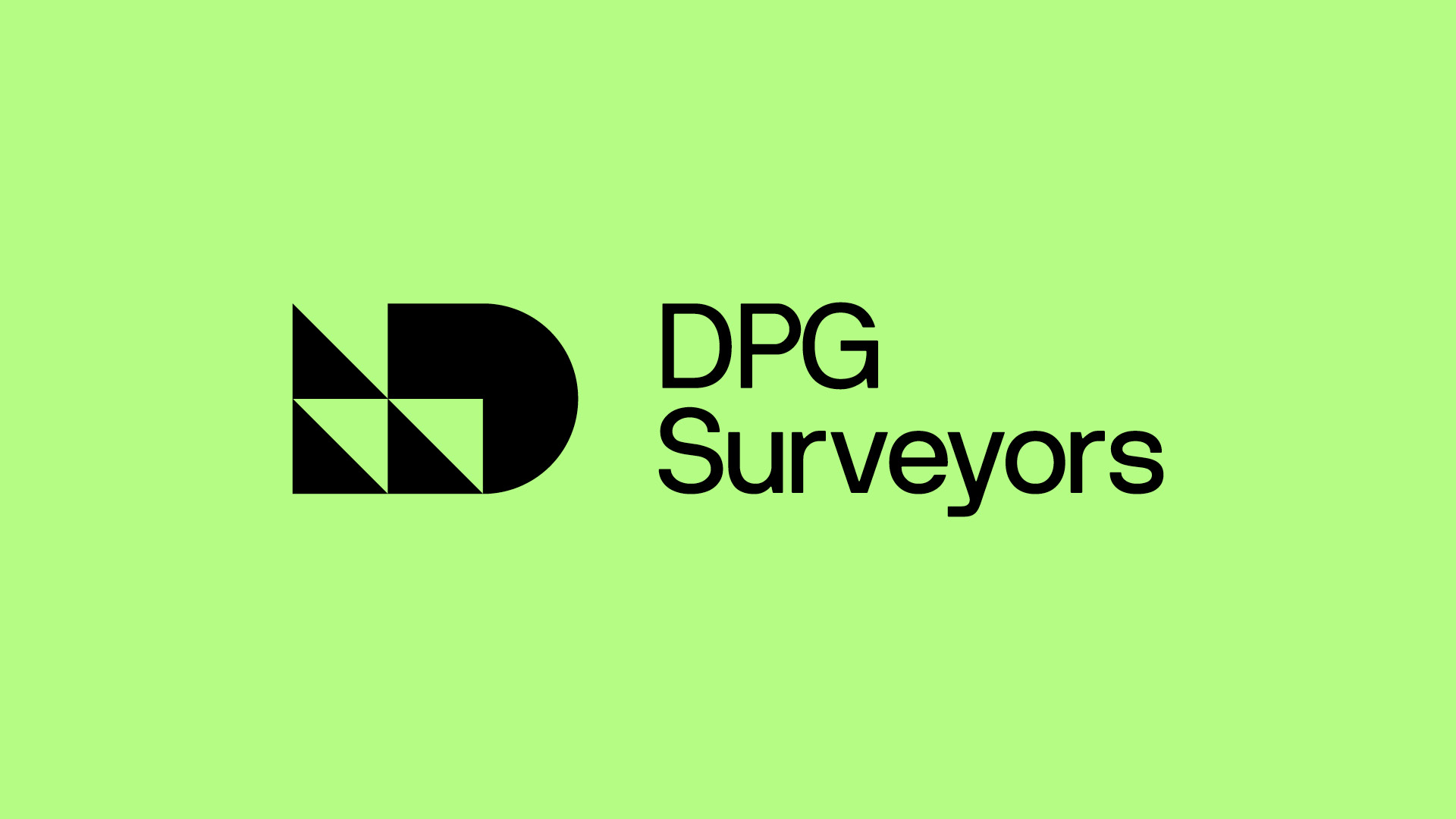
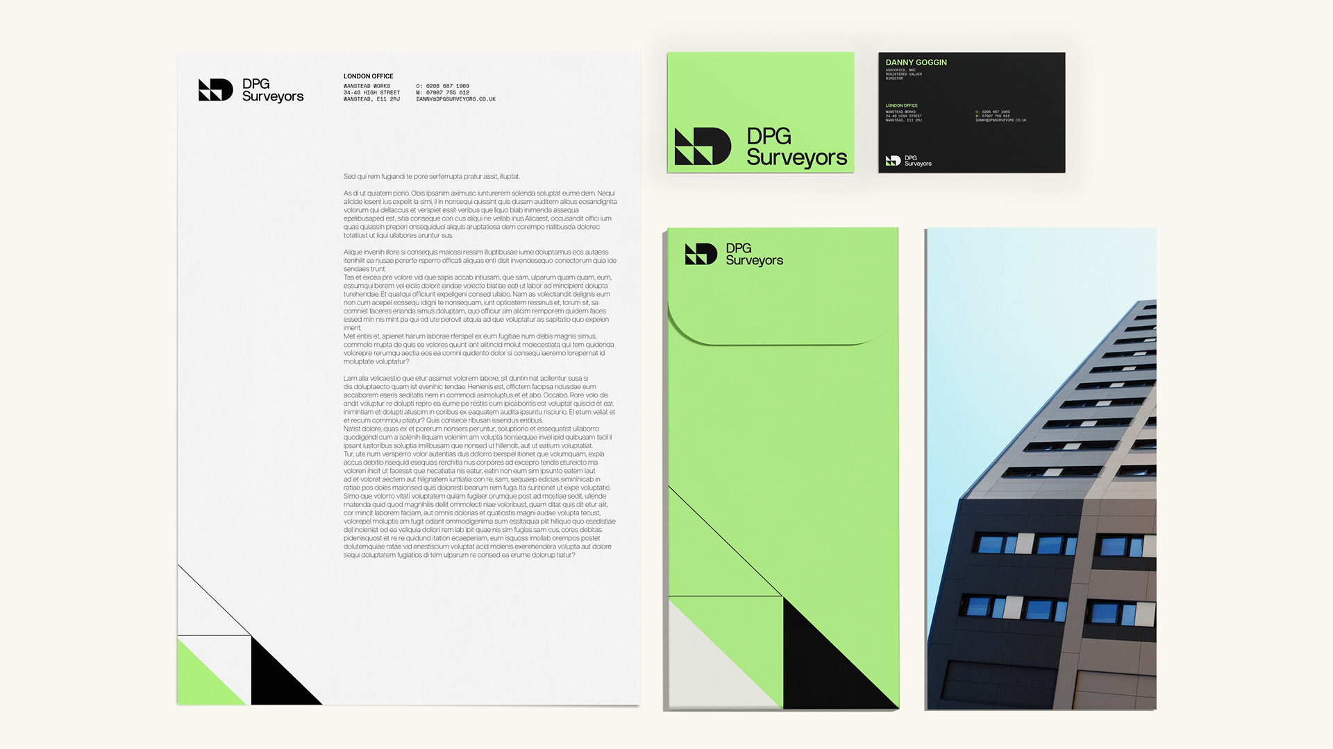
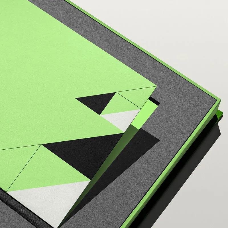
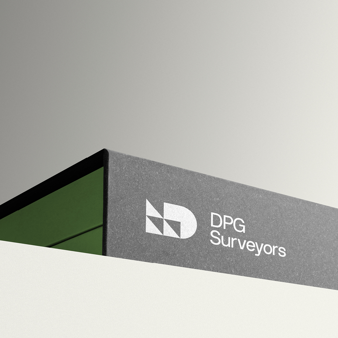
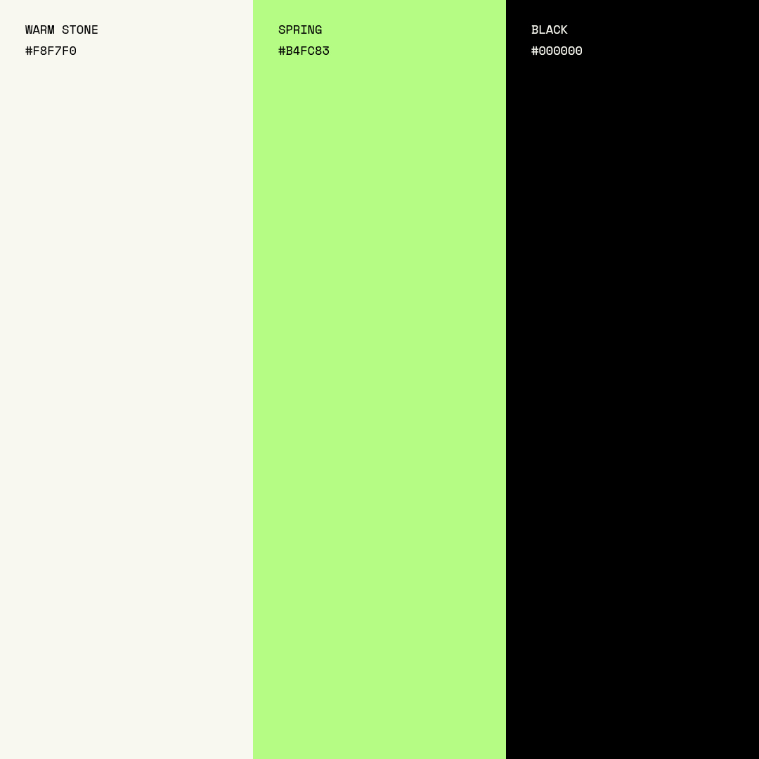
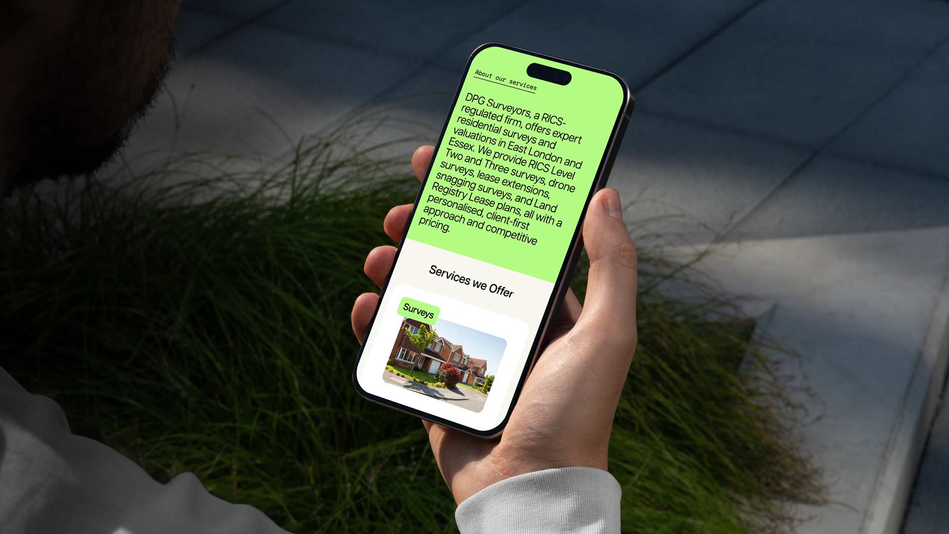
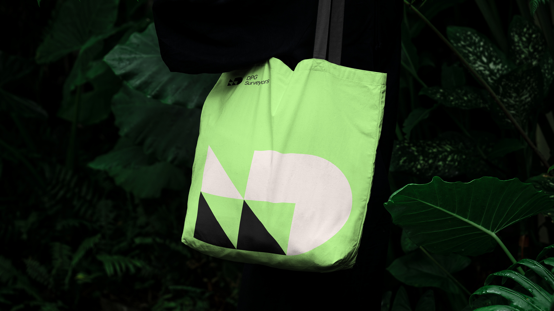
DPG Surveyors needed a brand that felt modern and approachable. A bold green wordmark and warm tones build trust, while a digital-ready system keeps it accessible and future-proof. The result positions them as a go-to expert across East London and Essex.
Brand Identity
Brand Guidelines
Digital & Web
Motion
Print Assets
Marketing Assets
At Cú, bold Mexican flavors and locally sourced produce converge to craft a distinctive culinary journey that is lively, inviting, and brimming with energy. To encapsulate this ethos visually, I designed a bold and vibrant aesthetic inspired by typographic music dance sleeves.
The outcome is a pulsating and typographically bold brand identity mirroring the restaurant's lively and dynamic approach to food and beverages. Infused with undertones of Mexican flair, the identity exudes authenticity and cultural richness, reflecting the restaurant's fusion of traditional and contemporary elements.
Overall, the brand identity captures the essence of Cú's vibrant and refined ambiance, establishing a cohesive and compelling visual language that resonates with a diverse audience of food connoisseurs and young professionals alike.