Connect and Collaborate Today


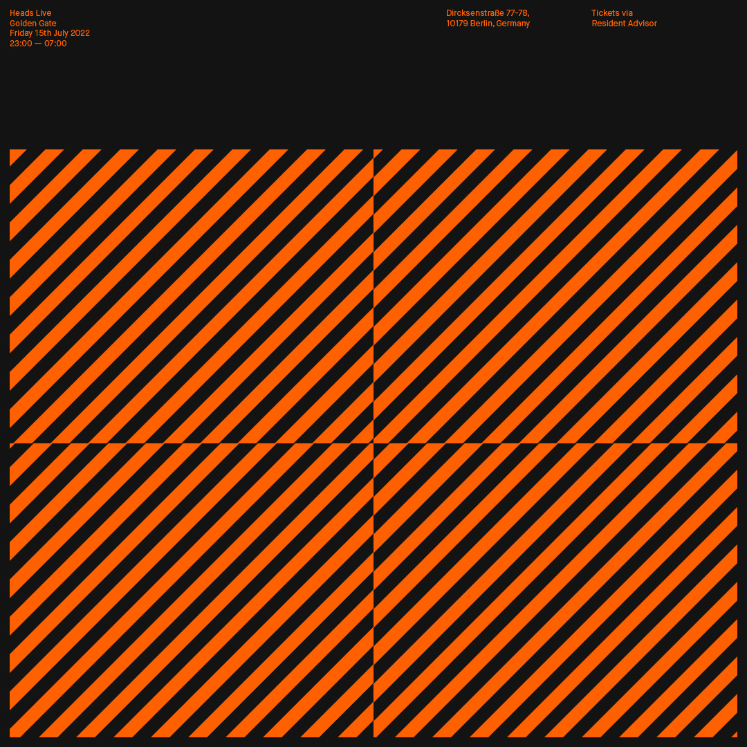
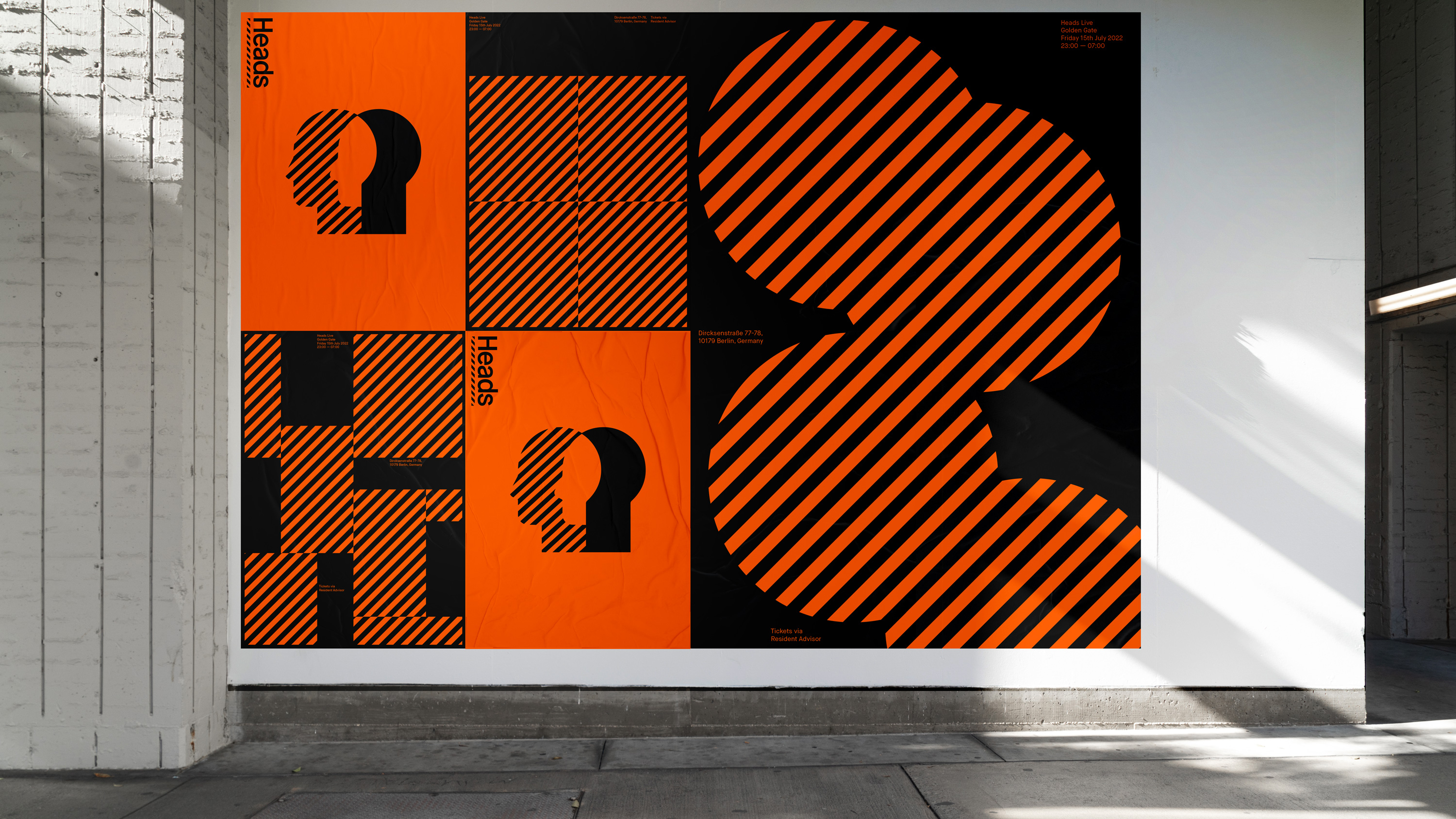
Heads’ identity captures music and unity through two bold silhouettes. A vibrant palette creates contrast and energy, while abstract 45-degree patterns add movement and flow.
Brand Identity
Motion
Packaging
Marketing Assets
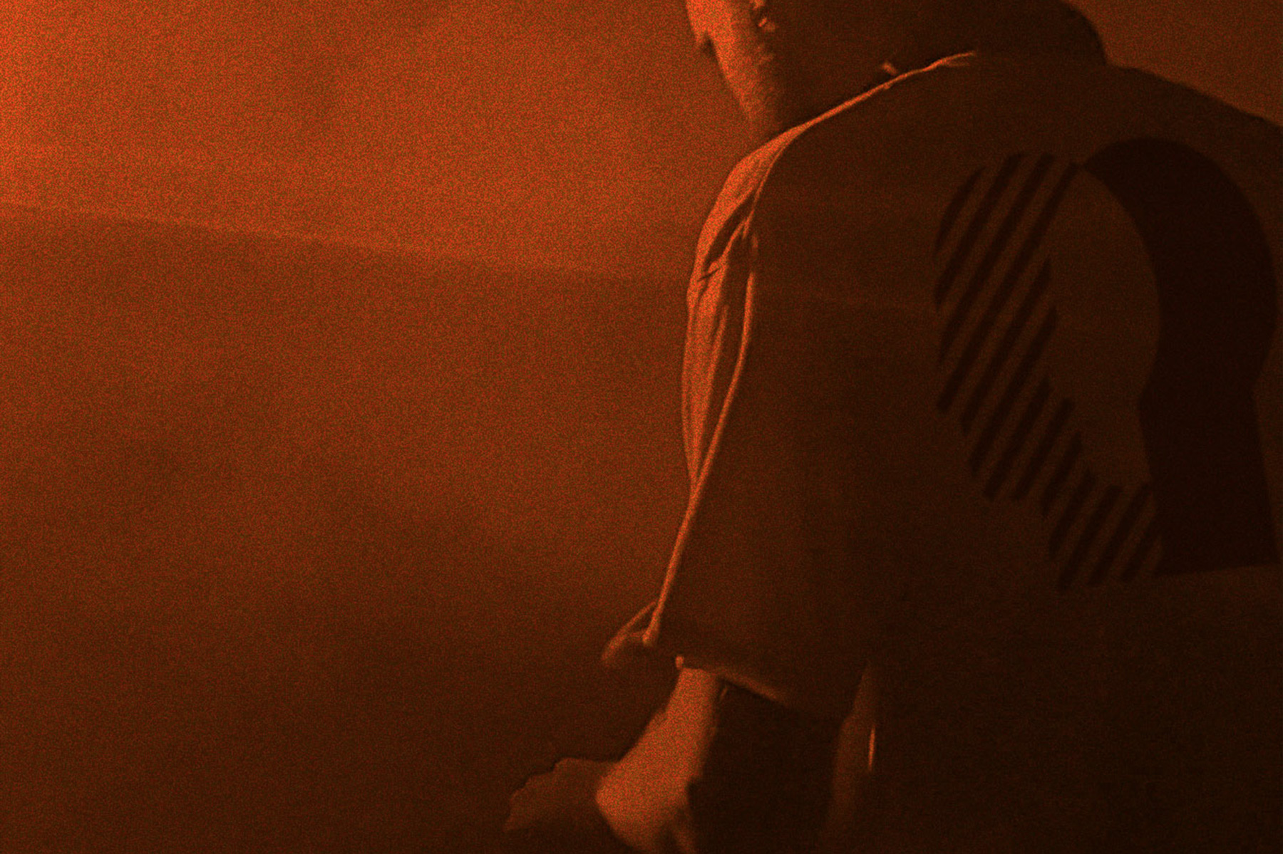
Merchandise
At Cú, bold Mexican flavors and locally sourced produce converge to craft a distinctive culinary journey that is lively, inviting, and brimming with energy. To encapsulate this ethos visually, I designed a bold and vibrant aesthetic inspired by typographic music dance sleeves.
The outcome is a pulsating and typographically bold brand identity mirroring the restaurant's lively and dynamic approach to food and beverages. Infused with undertones of Mexican flair, the identity exudes authenticity and cultural richness, reflecting the restaurant's fusion of traditional and contemporary elements.
Overall, the brand identity captures the essence of Cú's vibrant and refined ambiance, establishing a cohesive and compelling visual language that resonates with a diverse audience of food connoisseurs and young professionals alike.