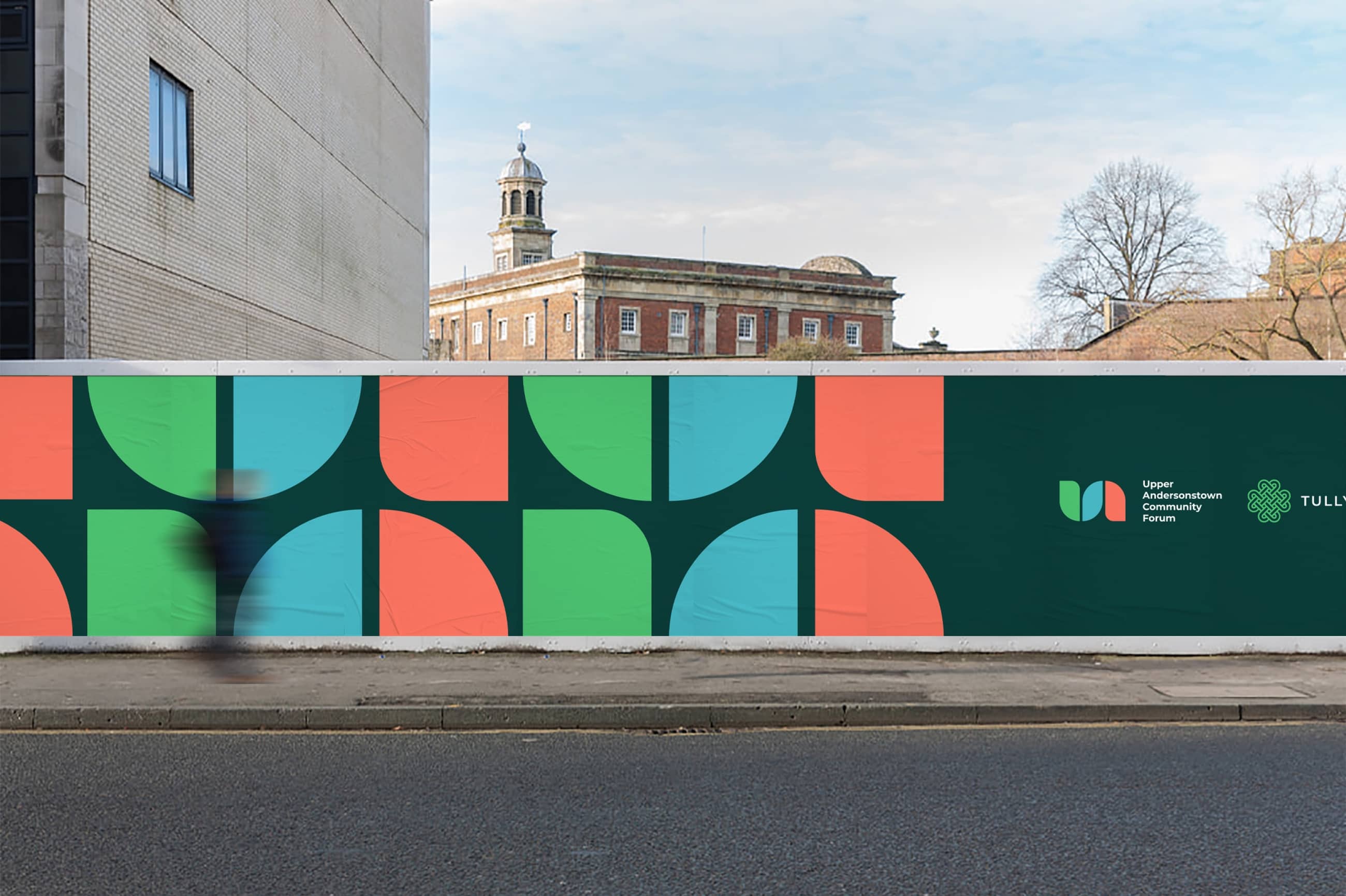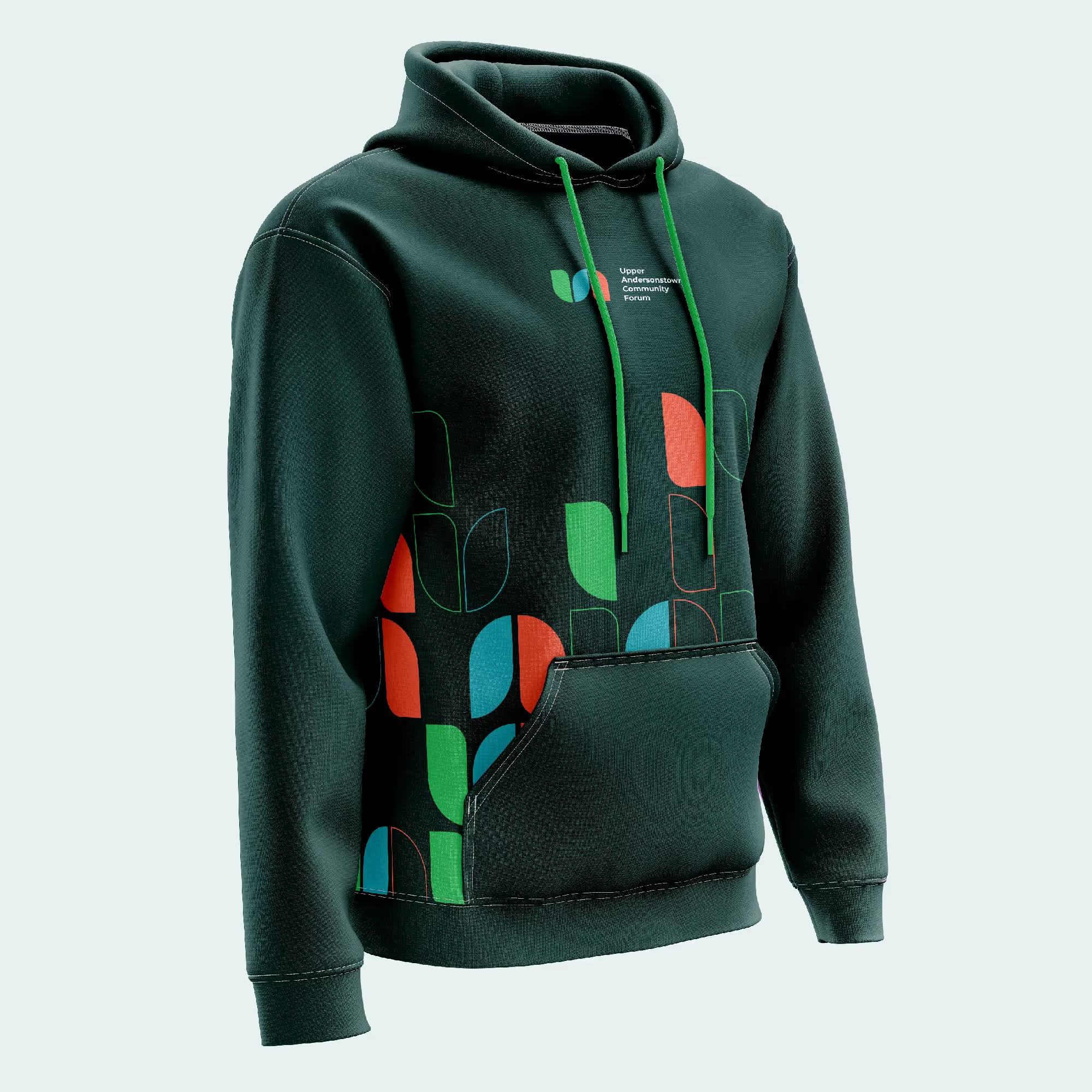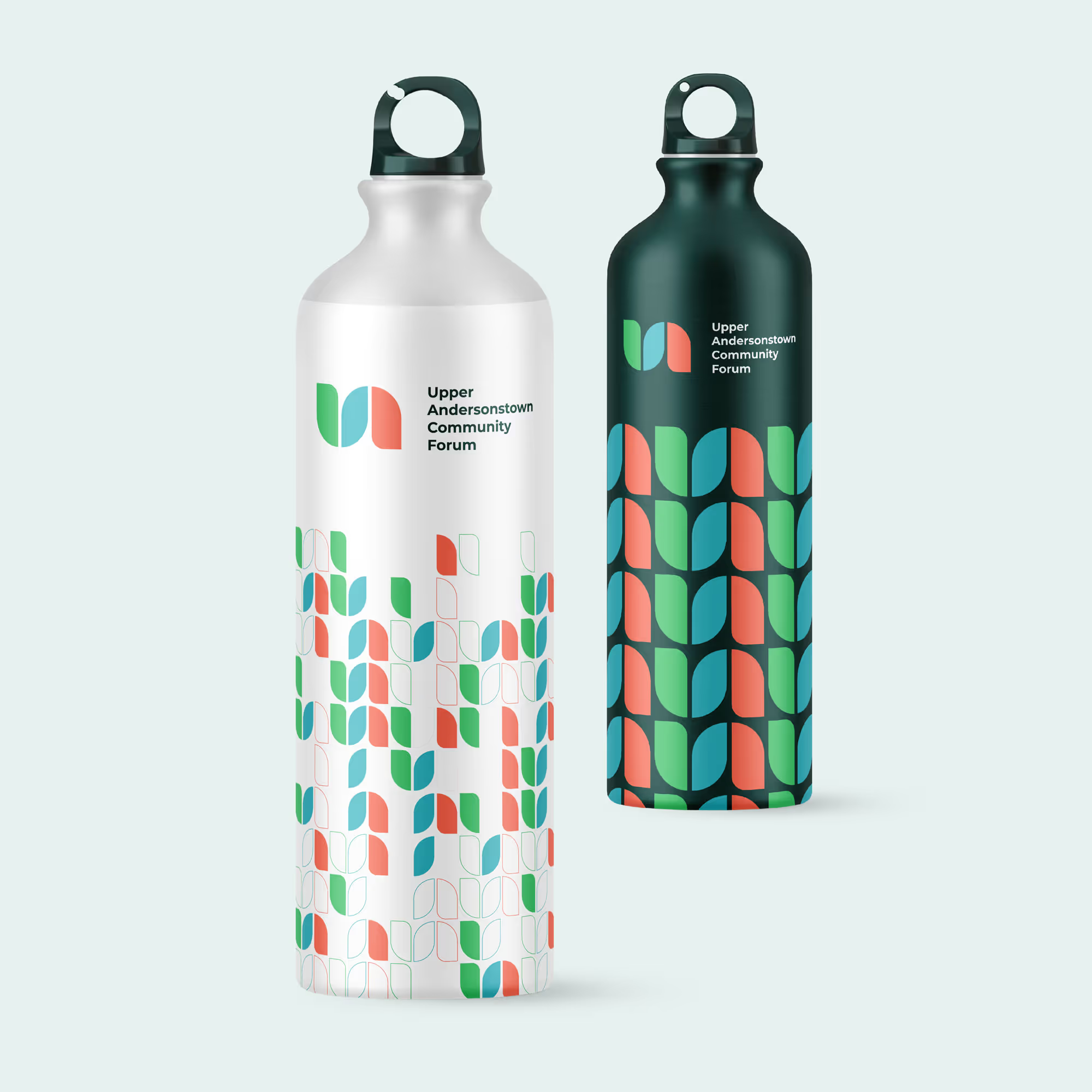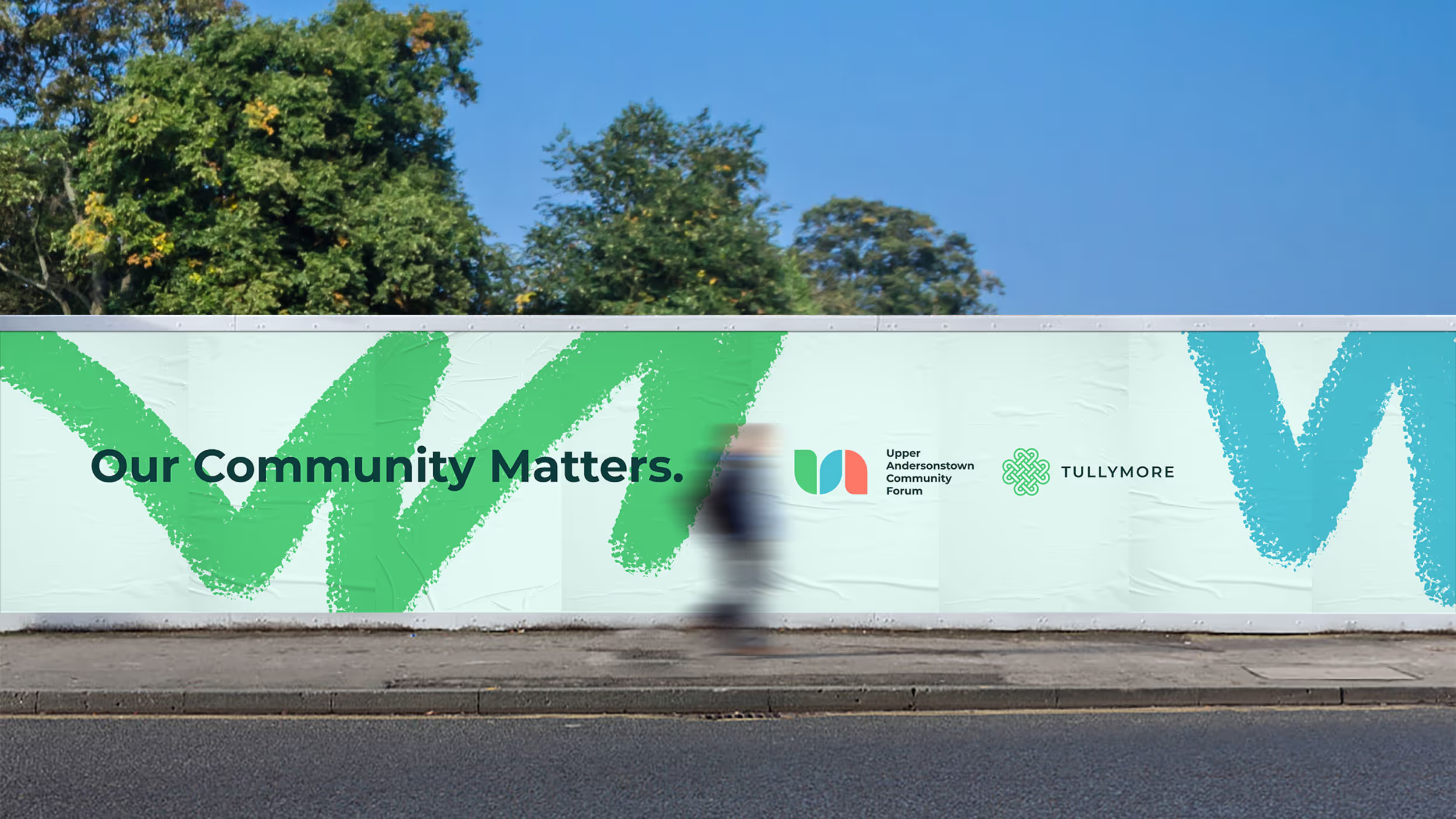

For more than 25 years, Upper Andersonstown Community Forum has driven positive change in its local area. They asked for a new identity to reflect their vibrant spirit, commitment to inclusivity, and deep connection to the community.
Brand Identity
Brand Guidelines
Digital & Web
Motion
Print Assets
Marketing Assets
At Cú, bold Mexican flavors and locally sourced produce converge to craft a distinctive culinary journey that is lively, inviting, and brimming with energy. To encapsulate this ethos visually, I designed a bold and vibrant aesthetic inspired by typographic music dance sleeves.
The outcome is a pulsating and typographically bold brand identity mirroring the restaurant's lively and dynamic approach to food and beverages. Infused with undertones of Mexican flair, the identity exudes authenticity and cultural richness, reflecting the restaurant's fusion of traditional and contemporary elements.
Overall, the brand identity captures the essence of Cú's vibrant and refined ambiance, establishing a cohesive and compelling visual language that resonates with a diverse audience of food connoisseurs and young professionals alike.
Edward set out to capture the energy and optimism of the community in the new identity. The palette combines fresh greens with coral and iris blue accents, reflecting the area’s natural character and vibrant spirit.
